Data Visualization
Interactive Dashboards · Insights Uncovered · Design for Impact
Overview
This multi-project data visualization portfolio showcases proficiency in presenting diverse datasets using spatial, statistical, animated, and interactive visual techniques.
Each project focuses on uncovering insights through tailored visual design—whether it’s identifying urban crash patterns, analyzing perception accuracy, or comparing international economic and health indicators.
Technology Stack
- Language/ Tools:
R, Tableau - R Libraries:
ggplot2, ggmap, gganimate, cartogram, sf, dplyr, cowplot, RColorBrewer, mapproj - Visualization Techniques:
- Animated bubble plot
- Raincloud plot
- Faceted heatmap
- Cartogram
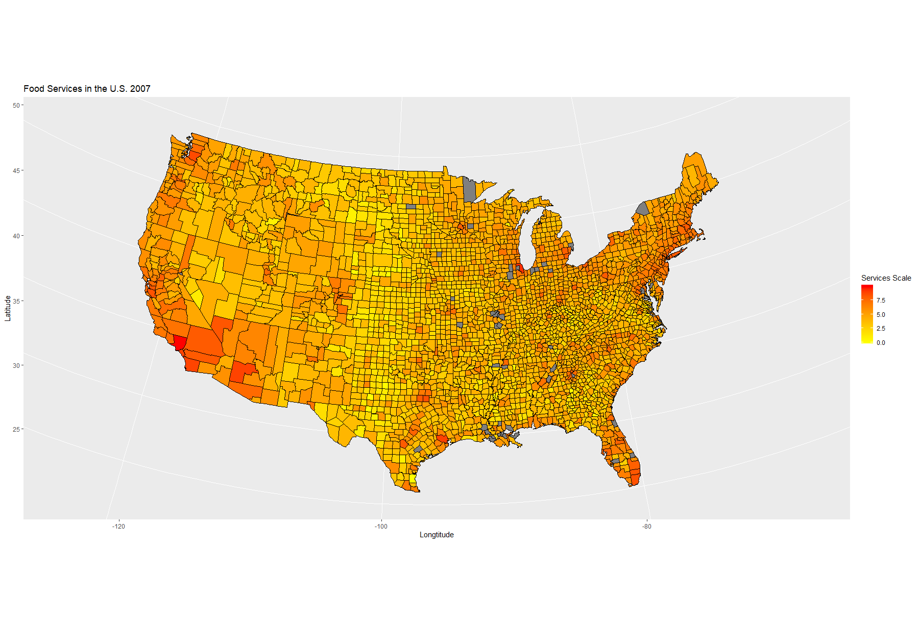
- Choropleth map (state/county level)
- Treemap and bubble charts
- Interactive dashboard (Tableau)
Methodology
and Approach
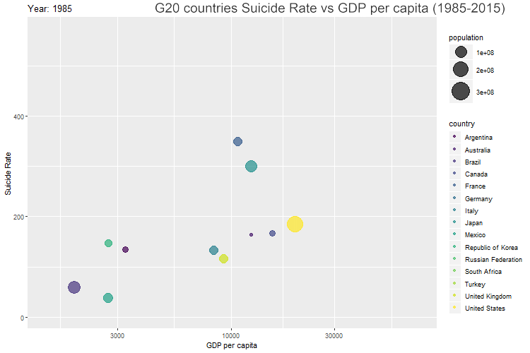
- Built animated visualizations with gganimate to explore multivariate time series (e.g., suicide rate vs. GDP in G20).
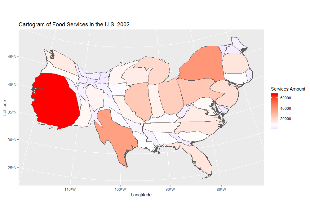
- Used cartograms to highlight magnitude-adjusted geographic representations of food services across U.S. states.
- Constructed interactive Tableau dashboards for filtering and country-wise comparison.
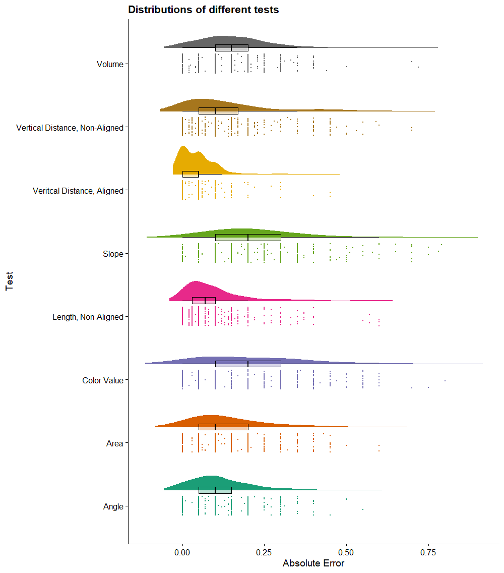
- Applied raincloud plots to compare perceptual error distributions by encoding type (e.g., position vs. volume).
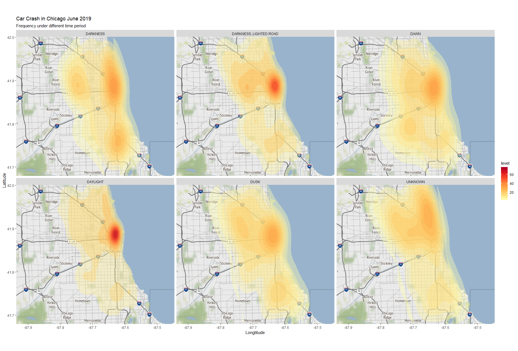
- Mapped crash data by lighting conditions and location, using layered density estimation.
- Developed treemaps and bubble charts to compare average car prices across makes and models.
- Standardized all charts for readability: consistent scales, labeled axes, controlled color gradients, facet wrapping, and proper legend integration.
Results & Insights
- Revealed that GDP and suicide rate trends differ widely across developed and developing G20 countries.
- Identified that position encoding produces significantly lower perceptual error than volume or color.
- Exposed uneven urban crash patterns in Chicago under different lighting conditions.
- Showed that certain U.S. states are disproportionately underserved in food service infrastructure, made especially clear via cartogram.
- Dashboard viewers can interactively explore correlations between country, GDP, and suicide data over a 30-year window.
Interactive Dashboard

Access Full Details and Files
For full project details, source files, and additional insights, visit the GitHub repository.